You may have learned a little about what sales enablement is and found out that it is quite...
Is your business lacking in the enquiry or subscriber department? You may find it’s not as easy to get in touch with you as you thought. People don’t scroll for the tiny ‘contact us’ text anymore.
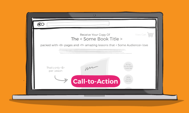
They want it shouting in their face as soon as they land on your website with a CTA (call to action). You might be asking, what is a call to action?
Well, A call to action (or CTA) is usually an image or ‘button’ with a line of text that tells your visitors to do something, or quite simply “call” to take “action.”
The action you want your audience to take could be: sign up to a newsletter, download a product guide, purchase etc. You can put a CTA in any form of content, whether it be your website, an email or at the end of a blog. However, there’s more to it than just plonking any old text and image in any place. Take a look at our call to action tips...
Create a clear call to action instead of hiding it
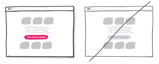
Making your calls to action (CTA) be more prominent and distinguishable in relation to the elements surrounding them. Your goal might be to data collect, get someone to sign up or sell a product or service. It’s vital to make sure that your visitors can easily see you CTA, make it stand out.
Test different CTA’s to see what has a better conversion rate. Test one thing at a time, change the wording, placement and colours. Keep on testing!
A higher contrast between your CTA and the rest of the page should be considered.
Try repeating your CTA instead of showing it just once
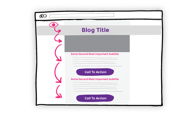
Something for the longer pages, try repeating your call to action. Repeating your CTA will have a subconscious effect on your visitors.
Don’t go overboard though, try placing mid-page and again at the bottom, it’s the natural ‘next-step’. When people reach the bottom, they pause and think what to do next - a potential solid place to make an offer or close a deal.
Bigger is better
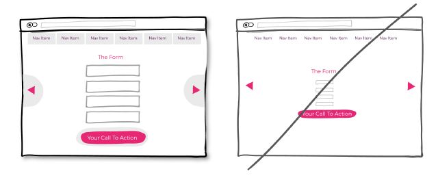
Try increasing the size of your CTA buttons and form fields. You want your visitors to take action by taking them to a landing page, buying a product or to leave their details. So, what can you do? Make the click areas bigger of course.
According to Fitts’ law, the closer the element is to us the bigger the object is, the more likely we are to press it, i.e bigger CTA button.
Keep focus on your goal
You may want to answer as many of your customer’s needs as possible by linking here, there and everywhere. Think twice if your goal on that page is for someone to click your CTA.
You take a chance when placing any links above your CTA as it runs the risk of taking your customers away from what you’ve been hoping them to do. If you are going to link, try opening your link in a separate tab to keep focus on your goal - for your customer to take action!
The ultimate goal of any page on your website is for you to get leads to turn into customers. Make sure your visitors can get in touch with you easily and clearly!
Use these simple call to action tips and you’ll see your conversion rates increase.

