As part of the move to do more with HubSpot apps, integrations and modules, Digital 22 has launched...
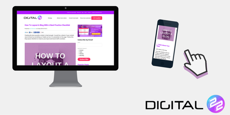
Creating the best possible content is hard enough. It would be a shame if your content was let down by something so fixable as how it is presented on the page. Follow this blog layout checklist to improve your layout and boost traffic numbers.
1. Think About Your Titles
Let's start at the top.
Your title needs to do two things; catch the reader's attention and let them know what your blog post is about. Then they can decide whether it's worth reading.
Users are now seeking information and content instead of letting it come to them; your title needs to stand out and reach them from the get-go.
2. Use White Space
White space (or in actuality "'whatever colour your background is' space") is vital for creating a great blog layout.
There needs to be plenty of space to make your content clear to read.
There shouldn't be any possibility of your reader having to block out noisy distractions near your blog content. That makes your blog an effort to read so they won't bother.
3. Manage Your Paragraphs
On that theme, keep your paragraphs short. People are reading your blog on a screen not in print so need manageable paragraphs.
They should also be interspersed with even shorter paragraphs.
You can try double spacing those to incorporate your good white space techniques. This helps the reader absorb key information and read at a comfortable, flowing pace.

4. Signpost Your Reader's Eye
Along with double spacing key information, you can always use bold text, sparingly.
You should also use sub-headings and numbered sections or sub-titles.
Readers will gauge the length of what they are about to read by checking the size of the scroll bar. They will then often scroll down the text, if it looks like it will be a long read, and will need to assess whether the information within is going to be worth their time.
Help them decide it's worthwhile by using clear and obvious signposts of key information.
5. Use Images
Images have two important roles.
They help to engage the readers at the top of the page and on social media, and they should also be used to supplement, break up and add value to your content.
500+ words of text is a lot to read on a screen without some form of light visual relief.
Witty, striking or helpful images will encourage readers to come back. Just avoid shocking stock photography.

6. Make Sure You're Mobile Friendly
We have covered this in previous blog posts about websites generally, but it definitely applies to your blog.
Make sure your paragraph width constraints allow around 80 characters and, if possible, can be optimised for viewing on mobile devices.
7. Utilise Lists
Whether it's because the reader only wants to find out the information they desire or because they are short on time and will only skim read your page; lists help you to present information clearly and precisely.
-
Use bullets to showcase important information.
-
Use them to recap or introduce new concepts that you will cover.
Or,
-
You can use numbers too.
-
They work well for step-by-step sections.
-
This is because people logically read them with escalating importance and dependency on the previous point.
8. Choose Fonts Wisely
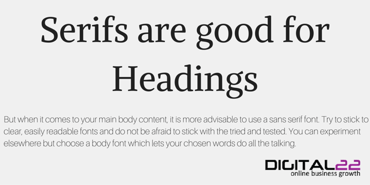
Sans serif fonts are the only fonts you should be using for main body content. Anything else will be too fussy to read on a screen.
Furthermore, you should stick to the most clear, screen fonts. You should also stick to only 2 fonts (at a push 3); use one headers and one for content.
Browse your options here and use complimentary colours on the same fonts to offer visual variety.
9. Express Yourself Clearly
Nothing will drive traffic away like a poorly written blog.
Spelling is crucial but so is grammar and syntax. You should write in an economical and clear fashion.
People are reading on a screen and are often time-poor when doing so. They will not have the patience to re-read sentences or lines of your content.
The golden rule is use as simpler and as fewer words as possible.

10. Keep Your Surroundings Tidy
Make sure your page is tidy.
There's no point following the other 9 steps to a great blog layout if you then have your content closely surrounded by things competing for the reader's eye.
Have your blog well placed on screen with good padding between surrounding features. And keep features to a minimum.
A simple navigation bar, sign up box and text only options to 'read more' are enough when it comes to how to layout a blog.
Ready For For More?
If you are now following these 10 steps of blog layout best practice, try downloading our FREE Google ranking factors cheatsheet.
This sheet will help you get your site onto the first page of Google's search engine results and drive your traffic higher.
