The 21st of April 2015, Google changed its algorithm to penalise websites that are not sufficiently...
Have you been looking for landing page examples? Well, you’ve come to the right spot. Landing pages are arguably one of the most crucial steps in a marketing plan. This is because of their unique way of enticing the reader to become a consistent reader of your content - so they need to be spot on.
Creating an effective, yet simple landing page is one of the most difficult parts of marketing as you have to have so many different aspects of text and design aligned, to impress the viewer enough to fill out a form. Because of the importance of a landing page, I’ll be running through six excellent examples of landing pages that have performed really well in recent years.
1. Drip
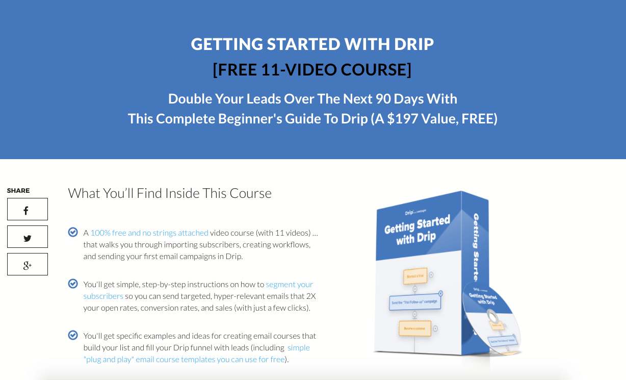
What Should Inspire You...
- They’ve clarified that they’re giving this valuable course away for free. This can increase conversion rates because people enjoy discounts. And by having a 100% off discount, people are most likely going to go for it.
- By saying “2X your open rates, conversion rates and sales”, it explains what the user can get out of it. This is good as it lets the user know what type of positive influence this guide will have on their company.
- They make the proposal sound relaxed by saying “100% free and no strings attached.” This will be more effective because the reader doesn’t have to commit to anything.
- They’ve highlighted buzz words like “Plug and play” and “segment your subscribers” so that they show the reader that they know what they’re talking about. This makes the course even more enticing for readers. After all, why would they sign up to something that sounds as though it’s unsure of what it’s offering?
- There’s a good text-to-image ratio as the picture doesn’t take your eyes away from the text. This is great because the reader isn’t overwhelmed by the image or the picture and therefore is able to understand the landing page.
- They clarify what the user gets if they sign up with the [FREE 11 VIDEO COURSE]. This allows the user to clearly know what they will get if they sign up through the landing page.
- Drip are very clear about what will happen when they sign up. There’s no cringey nonsense or buffer words to make it seem more articulate. Because of this, it shows that Drip are genuine and not trying to overwhelm the reader. This will develop into more loyal customers as they get what they expect.
2.VideoFruit
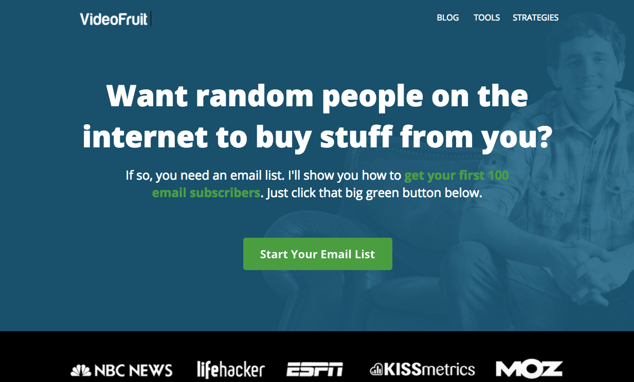
What Should Inspire You...
- There’s a very simple title for the average person to understand and the educated person to have a laugh at.
- Shows what you get when you sign up and guarantees “100 email subscribers” which is a great selling point. It also shows how subscribing to this guide will benefit the reader.
- The way they’ve phrased their language on this landing page is so simple that it’s added an almost sarcastic voice to it. This makes them sound more human. Sounding human is very effective because it lets the reader know that you are a genuine company with faces behind the name.
- VideoFruit have laid out the text so that it attracts the reader’s eye to the big bold title. This then keeps your attention by shrinking the text and drawing you to the “big green button”. It’s ideal as you would want the reader to instantly notice the big green button as that’s where they sign up.
- They flaunt some of their connections at the bottom of the page to show that they’re trustworthy. This is good because it shows off their authority and expertise.
3. MeetEdgar
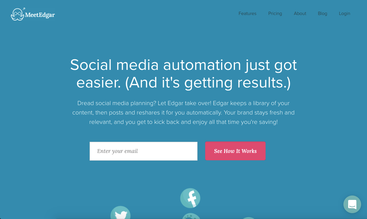
What Should Inspire You...
- There’s a very captivating headline as they know that their target audience will have an opinion on social media automation. They’ll also care about if it could be made easier for them.
- MeetEdgar has used an interesting social button design where they’re falling. This is good because it is unique and different to other, forgettable landing pages.
- The soothing tone in the text below the headline which reads “let Edgar take over” almost acts as if readers don’t need to worry about their social efforts. Which is certainly something the readers are looking for.
- It’s very obvious where the readers need to fill in their details and where to click on. This is more convenient to the reader and more user-friendly because they don’t have to try to find where to fill out.
- The format of going from large print to small is sort of like a funnel for where you read. This is so you read the right things in the right order (or as the landing page wants you to).
- Makes a generic appeal too as the majority of people would be attracted to the idea of being able to “kick back and enjoy all that time you’re saving.” So, it ends on a really strong and enticing message. This is good because it delivers the final point strongly to the reader and therefore is more influential.
4.Louder Online
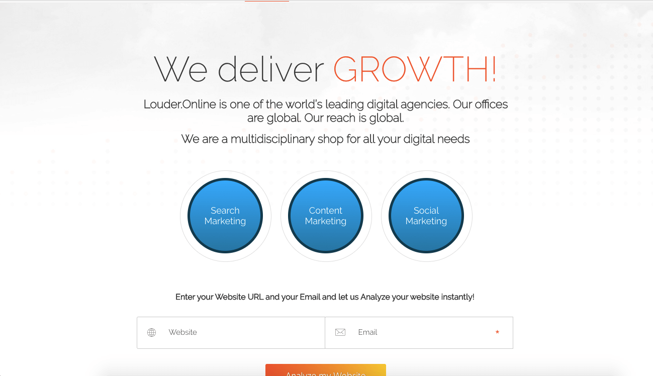
What Should Inspire You...
- Louder Online have used very clear message all throughout the landing page. This lets the reader know what they are going to get if they sign up.
- Highlighting “GROWTH” and changing the colour allows it to stand out dramatically. It’s something the reader is instantly drawn to. Every company wants to grow, therefore this is a good message to make clear in the landing page.
- The buttons show exactly what the reader will get if they sign up. Therefore, it essentially promises to solve their pain points. This allows the reader to acknowledge that this landing page can help them and they will benefit from signing up.
- Captivating design as the colour scheme is subtle and effective as well as the layout being neat and tidy. This is good because it portrays the business as professional and shows they pay attention to detail.
- “Enter your website URL and your email and let us analyze your website instantly” is a really strong message and literally explains exactly what's going to happen. It lets the reader know exactly what to expect when they sign up rather than leaving them in the dark.
- They’re offering a unique free package of giving away an analysis tool instead of a piece of content. This is great because it isn’t something you see every day and will surprise the reader. Which then makes it more likely that this landing page will stick in their minds.
5.HubSpot
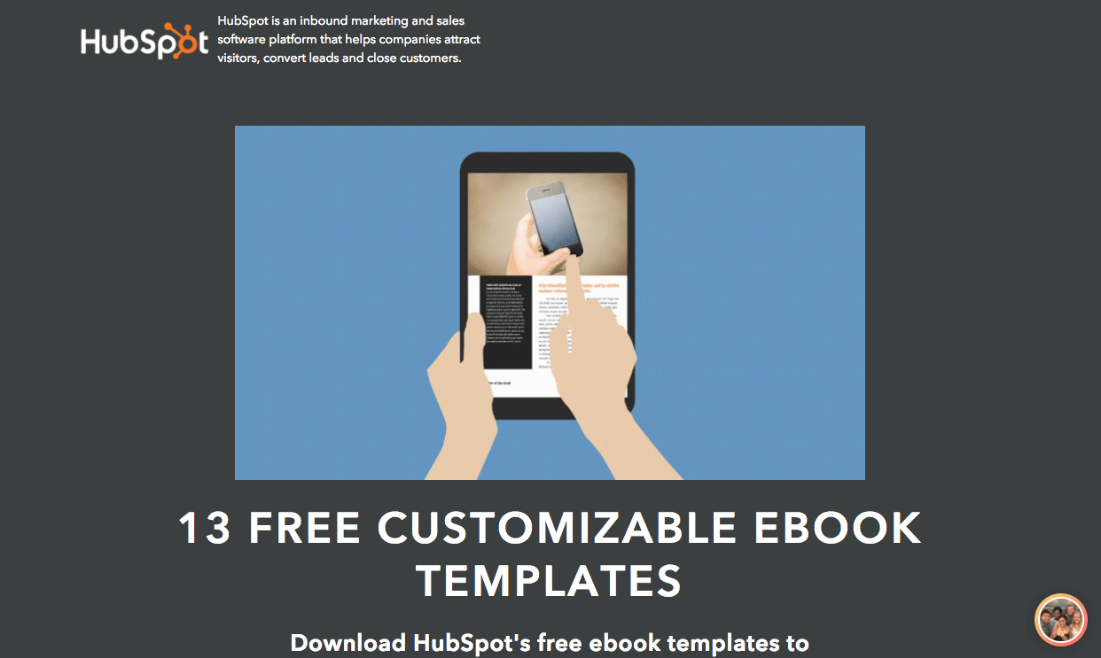
What Should Inspire You...
- HubSpot has used a gigantic and obvious CTA. It’s clear what the reader needs to do and HubSpot makes it very difficult to miss as there’s no confusion.
- Free stands out as the eye-catching word. It’s a simple yet massively powerful word that can encourage the reader to take action.
- The chatbot in the corner is there to help with any questions the reader may have. This is very effective as it stops the reader from being confused.
- Even though the image is huge, it doesn’t distract you from the text. This is effective because the text is the part you want readers to actually focus on - not the image.
- Applicable to a specific audience as the CTA will only be put in the blogs this type of person would read. This is clever because it makes the landing page more personal and appeals to a subject that this group of people will know about.
6. MotleyFool
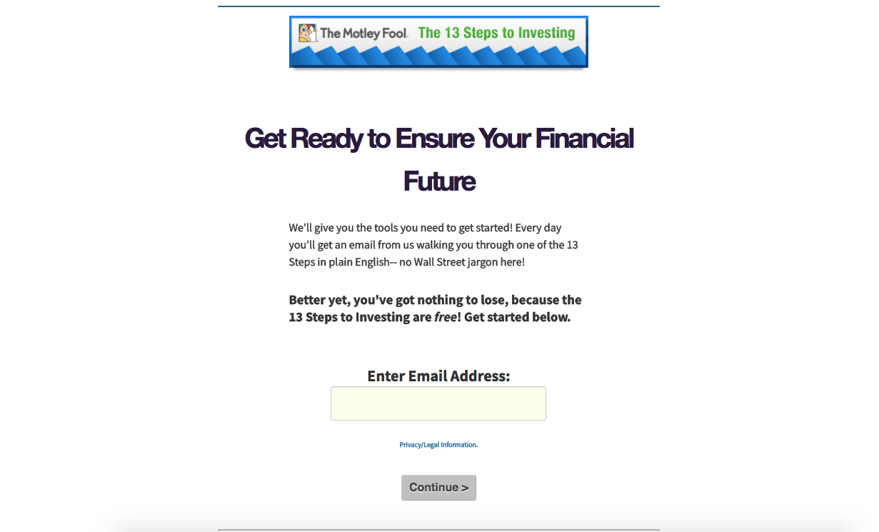
What Should Inspire You...
- The message is loud and clear. This is good because it stands out and makes the purpose of the landing page clear to the reader. There’s no need for them to fumble around, searching for what the page is for.
- “Well give you the tools you need to get started.” This is really reassuring for the reader to see as the person who would be reading content like this is more likely to be financially unstable and need assistance.
- “Plain English - no Wall Street jargon.” This phrase makes it more appealing to a person who may be reading this as they’re unlikely to want to read complex terminology. After all, would they really need help with investment if they knew about the Wall Street jargon?
- The page adds more value the more the viewer reads on as they keep adding more information about what the reader is going to get out of this submission.
Throughout these six examples, there has been one clear theme - you need to get to the point. All of these have showcased why being concise and clear with your message is effective and easy. So if you’re building your own landing pages, use this blog as a treasure trove of inspiration to find the best landing page for you.
Another key part of your marketing efforts and website build is the health of your HubSpot account. Without proper maintenance your marketing efforts within HubSpot can become lustred, leading to more and more problems.
Do better marketing with your free HubSpot essentials guide
Along with landing pages, you need to think about lead scoring, user permissions, the sales pipeline and so much more.
Because of this, we’ve developed a Hubspot essentials guide so that we can help your marketing efforts to be clear and easily understandable. Click below to get your free copy.