This month, Amit Singhal will be retiring from the Head of Google Search and will be replaced by...
Without making any announcements, Google Search had made some changes to its interface for tablet users. What do you think?

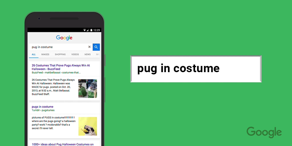
If you regularly use your tablet to search the web, you'll be surprised to see how Google has updated its search interface.
Originally the interface was similar to the desktop and mobile appearance but now it has changed into this.
 source: Search Engine Land
Now, search results on the tablet have a tab-like appearance. The navigation bar at the top is evidently smaller and there is more space on either side of the searches.
A Google spokesperson said to Search Engine Land about the new changes, “this week we began rolling out a new tablet Search results page, bringing the best of Google Search to tablets.”
From the changes, we can see the new interface is designed primarily to improve search. As we can see in this screen shot, there are no distractions from ads but instead a clear focus on search results.
 source: Google System
From what we can see at the moment, the new update looks good - but let's have a closer look at the changes:
Simpler interface design
Google's decision to choose a simpler interface design sounds great for today's searchers as more people are using tablets to access the internet.
Earlier this year, Google said all websites had to be mobile friendly and the updated Google Search for tablets has changed to benefit mobile searches. The tablet interface looks like it's perfect for people on the go.
Larger tabs
In the US, over 50% of people use their mobiles to access the internet.
Because Google has introduced bigger tabs on the Google search results for tablet, it suggests the new interface has been designed to improve the search experience.
However, so far, there has been some negativity toward the new appearance.
 source: Search Engine Roundtable
Some of the backlash toward the new interface is because it doesn't give quick answers to questions like it does on desktop.
In theory, larger tabs should be better for searchers using a tablet but so far it's not being positively received.
Improved local searches
 source: Search Engine Land
One major change on the interface is the appearance of business locations. Now when you make a local search, the entire result takes up the screen. This is great if a searcher is looking for an exact search because it stops them from getting distracted by any other search results.
As the Google search interface is still new, it's hard to see if this update will also have a negative impact for some local searches. For businesses who rely on local searches to get them business, they could find themselves with more competition to get in the top search results to be seen because the search page is smaller due to the larger tabs.
At the moment there is a mixed reception to Google's new tablet interface. The idea of having tabs, simpler appearance and a smaller navigation bar all sound like great ideas. But so far, in practice, it doesn't seem to have benefited the user.
In a few months when users have gotten used to the new interface, people may appreciate the new changes but for now we will have to wait and see.
Here are other recent Google updates SEOs needs to be aware of:
There are many SEO myths and misconceptions filling the web. Don't be fooled by the fiction, check out our FREE guide to get all the right information.
What do you think of Google's new interface?