
Lead grading (also known as lead scoring) is the process of assigning numerical values to each lead...
O
ptimising the conversion rate of your sign-up forms is a key building block in the online sales and nurturing process.

It's the point at which your visitors decide whether to become a lead or not, so forms must be prioritised when it comes to reviewing your site's
performance and optimisation
.
Obviously, having any type of form is better than none, but here are some quick wins that you can implement on your forms to help increase the number of contacts gained. Here is an explanation of 6 quick CRO tips to try on your own sign-up forms.
1. Consider The Number Of Fields
All the marketing blogs point out that less (fields) is more (conversions), when it comes to sign-up forms. And as a general rule, that is most certainly correct. However, this needs to be balanced between two factors.
Is asking solely for a name and email address enough information for an effective nurturing process, or do you need something more?
The answer to this needs to be balanced against how the user will view your form; do the amount of fields that they have to complete to submit the form justify what they will receive in return?
Targetting 2 (ideally) to 5 (maximum) is a good starting point.

2. Be Clear What The User Gets Out Of Completing It
And on that theme, the user needs to be crystal clear what they are going to get out of completing your form. They need to know why they're giving you their contact information and what will happen next.
Most users now know that submitting your email address to a company is going to result in some sort of marketing information landing in their inbox. That's why it's worth reminding them why they want to fill this form out in the first place; to receive a download, to hear the latest news and offers, to enter a contest or even to book a sales call.

If they are going to receive a couple of emails over the next week, consider telling them. Honesty is often the best policy and be sure to remind them they can always unsubscribe.
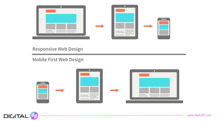
3. Ensure Mobile Friendliness
Yeah, yeah, the majority of users are now on mobile devices. Yada-yada, blah-blah.
So why are plenty of forms still not mobile optimised and are too big a faff to complete on a touchscreen? You don't want to risk abandonment over such an obvious issue. Test the mobile friendliness of your submission forms otherwise non-responsive forms can risk you losing valuable leads.
4. Find The Right CTA Copy On Your Forms
General consensus points to avoiding the simple "Submit" button as it is too committal. I get that. It completely reminds the user they are submitting information and ignores the fact they are getting something in return (whatever it is, you're offering).
A good way to optimise is to employ a more guarded or hedged piece of CTA copy at the end of the form. "Click Here", "Download Now" and "Read Now" all use softer connotations than "Submit" and forget the fact you are gaining info from the user.

Two word, verb inclusive and time orientated copy like those previous examples is proven to boost submissions. This is echoed in this excellent report by Formstack.
5. Employ Smart Forms
Smart fields and smart forms speed up the form filling process for your users, optimising the form for them and increasing the likelihood they will submit. Oops, sorry, not "submit" but "click here".
Besides inputting already known information, developed smart forms and fields (like those offered by HubSpot) can remove already known information fields from the next form a user submits. This builds a more complete contact for your sales team to engage with.
Optimising the conversion rate of your sign-up forms is a key building block in the online sales and nurturing process.
(Click Here to Tweet)
Social accounts can be used to auto-fill forms too. This has shown amazing increases in form submissions.
6. Keep Testing And Keep Adjusting
Like all aspects of life online, you need to keep testing and adjusting the content of your forms. Heatmaps, A/B testing, alignment layout changes and multi-step forms are all things that you will want to try and see the effectiveness of, at some point.
Many of these techniques may already have been applied to your site design as a whole, so you'll already be familiar with them, but the same principles and tests can be applied to your forms. A good thing to maybe test would be how effective the sizing of a form might be.
If anything, from a sales and conversion point of view, your forms are the first place you should be applying these techniques and tests. This is because they are your means of gaining leads and contacts, so they should be highly optimised.
Improved Forms Means Improved Traffic - Deal With It Properly
If you're looking to improve your inbound efforts with some lesser known, hidden gem techniques - take a look at this big reference resource our award winning team put together. If you're inbound marketing efforts need a boost but you are out of fresh ideas, try this: