The people you’re attracting from Facebook are brand new visitors who are at the beginning of the...
Creating landing pages is a key part of website conversion optimisation because they are responsible for convering your online visitors into contacts. If people are clicking on your Call-To-Actions but failing to complete the contact form, it's likely there is something wrong with the pages your visitors are landing on. For your inspiration, we've collected the best and worst landing pages we've come across so you can create successful pages that convert.

Let's start with the WORST landing page examples...
1. Grosvenor House Publishing Limited
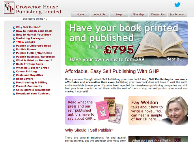
Nowadays it's important to have an up-to-date web design. Otherwise prospects will think your business is old news.
This web design is outdated. From first impressions, it makes you think this site hasn't been updated in years. As a landing page, it has relevant offers that will engage with their ideal customers but it doesn't have a sign up form. Contact forms are needed on landing pages to convert visitors into leads, without them your landing page won't produce results.
2. Office Furniture
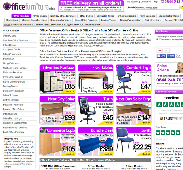
After landing on here from a Paid Ad, I've almost forgotten what I was searching for in the first place. There is so much clutter, I have no idea where I'm supposed to look.
This landing page is in serious need of white space to make the content and images more digestible. This page lacks a clear direction for the viewer.
On a positive note - on the lower right hand side they have customer reviews which is encouraging social proof! But I only found the reviews because I was trying to find a redeeming feature.
3. Nouvm Publishing

Again, another outdated web design.
Having fresh and up-to-date design is vital for landing pages. First impressions count when it comes to your website's conversion rate.
This page would benefit having the contact form higher up. There is nothing wrong with the content in the top paragraph but it should be lower down because it's a distraction from the sign-up form.
4. Marketo
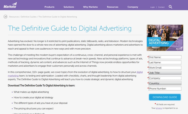
Maybe it's a little harsh to put this on the list of worst examples of landing pages but there is real room for improvement here.
For a start, there's too much content and this makes the page feel cluttered. The bolded title 'Download the Definitive Guide..." explains what the download is and the bullet points do the downloadable content justice however this should be futher up the page. Most online visitors will start reading from the top so they will likely get bored before they reach the bullet point section.
The contact form is intense. As mentioned before, contact forms should only ask for necessary information like an email address and a name. Having lots of sections to fill is labour intensive and will likely deter people from signing up by not finishing it.
Let's take a look at some of the better examples to see what these guys should be doing!
Here are the BEST landing page examples!
1. Basecamp
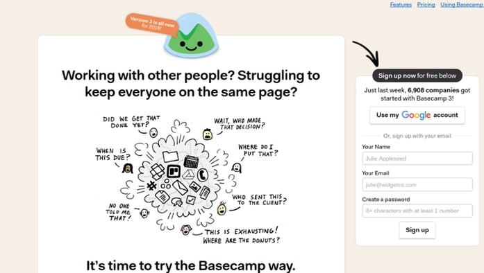
Basecamp's landing page does the trick.
Their main image highlights a pain point their ideal customers are feeling; they want to keep on top of what their team is doing. The content is limited but it's their image that does most of the talking.
The sign up form is really simple too. You can create an account or sign in with Google, altogether it should take less than 15 seconds to convert from a visitor and into a customer.
2. Magic Freebies

This landing page could have been crammed with images of free products and content but it isn't. Having a handful of well known products followed by a promise you'll get free samples every day is a strong prompt to sign up. The use of white space makes the content and images stand out and there's no unnecessary distractions.
The contact form's button 'Send Me Freebies' is very enticing too and better than the traditional 'Submit Now' or 'Sign Up'.
3. Parcel2Go
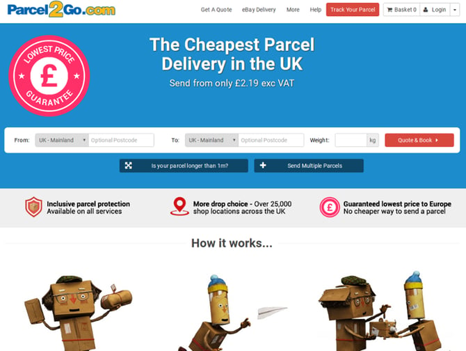
When quickly looking for a courier service, Parcel2Go's landing page meets the need of their ideal customer. Immediately on the landing page, the submission section is at the top, in 30 seconds the potential customer can submit their information and get a quote.
This landing page could have had detailed descriptions of each step but the three cartoons below explain perfectly.
4. RSPCA
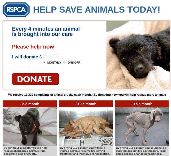
Emotion is used in the images and the content to create a powerful landing page. The animals are looking into the camera and at the potential donator making the images more engaging.
This is an example of a successful landing page because it provokes an action.
5. Zoho

Using one main background image of a team working well together, Zoho's landing page suggests their project management software is an effective tool. Their choice of content is very persuasive. "Plan, track & collaborate easily now" perfectly engages with their ideal persona who is looking for better management techniques and as an extra benefit it sounds like Zoho's software is easy to use.
The sign-up button stands out and immediately grabs your attention.
Seeing the worst and best examples of landing pages has hopefully given you some inspiration to start improving your own landing pages.
Want more tips and techniques on how to improve your inbound marketing strategy?
Download our free guide.
