Another aspect of the super-fast AMP project is Landing Pages. The community has now also...
Website conversion is the percentage of visitors that visit your site and complete an action such as purchasing your product or signing up for your newsletter.
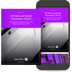
How can you increase website conversion? Just a small change can have a big impact on your conversion rate. These 40 tried and tested ideas we are about to show you, are being actively A/B tested by us and others.
This is a really long post. If you want to save your copy for later get it here
#1 Create Personas Instead of Targeting Everyone
Perhaps one of the most important tips is to create your buyer personas.
Do you know who your target audience are? Do you create your content with those people in mind?
Your ‘personas’ are your ideal customers. Think about your current customers, what are they looking for, what are their challenges? What would they ask? What problems are they facing? How can you solve their problem?
#2 Use Responsive Design Instead of Static
There is nothing worse than double scroll-bars. It’s painfully taxing, like looking at a map through a keyhole or constantly pinching and zooming on your iPhone. You might be getting sick of hearing about responsive design, but seriously we can’t stress enough how important it is. In a digital age, you really can’t afford to not have responsive design (your website page will adjust to your devices). The figures don’t lie, 25% of searches are done on a mobile device by over a billion users worldwide!
#3 Use Clear Copy Instead of Unnecessary Words
Keep your copy concise using shorter sentences, and less words. Check your draft, get someone else to read and highlight any unnecessary words. Keep the attention of your audience by conveying your core message without waffling on.
#4 Use White Space Instead of Cramming
White space is your friend when it comes to a high converting website, it will make your copy far easier to digest. When you have a chunk of writing for example, create more space between your paragraphs allowing people to see it individually, rather than being phased by a huge chunk of text.
#5 Try One Column Instead of Multi Columns
Using just one column in your layout gives you more control over your copy.
It will make it easier for your visitors to read. Multi column approach runs some additional risk of being distracting to the core purpose of a page. Try using a clear call to action at the bottom of the column to guide people down.
#6 Create a Clear CTA Instead of Hiding it
Your goal might be to data collect, get someone to sign up or sell a product or service. It’s vital to make sure that your visitors can easily see you CTA, make it stand out. Test different CTA’s to see what has a better conversion rate. Test one thing at a time, change the wording, placement and colours. Keep on testing! A higher contrast between your CTA and the rest of the page should be considered.
#7 Try Repeating Your CTA Instead of Showing it Just Once
Something for the longer pages, try repeating your call to action. Repeating your CTA will have a subconscious effect on your visitors. Try placing mid page and again at the bottom, it’s the natural ‘next-step’. When people reach the bottom, they pause and think what to do next - a potential solid place to make an offer or close a deal.
#8 Try Using Labels and Place-holders on Forms
Something which seems obvious to you might not be so obvious for everyone. If you have a form on your website, make it simpler for people to fill in. Use a form label or place-holder. There will be no confusion about
which piece of information goes in each box. Use the asterisk (*) for details that are mandatory. Don’t create those annoying forms that tells you something is missing after it has been submitted.
#9 Keep Your Form Fields to A Minimum Instead of Showing too Many
If your goal is to get someone’s email address, then only ask for their email address. If your goal is to build a list of a certain persona then you are going to need more than just an email address, but still keep it relevant. Focus on your goal and don’t distract from it. Each field you ask for runs the risk of making your visitors turn around and give up.
Remember less is more
#10 Try Less Choices Instead of Giving too Many Options
The more choices given, the harder it is to make a decision. When you go to a restaurant that has endless choices, it takes you a lot longer to decide. Making a decision between too many choices can cause us to worry and question ourselves. Studies have found that more people convert with less
choice. Don’t overwhelm your visitors with too many choices. Remember: less is more.
#11 Give Feedback Instead of Keeping Quiet
When you complete a task such as submitting a form for more information, it’s advised visitors are notified that the task was completed successfully. Silence breeds uncertainty. Prospects will be left asking themselves: was it sent? Did I do it right? What if they don’t get it? Give your visitors closure, let them know that you’re taking the next step and avoid any confusion.
#12 Try a Landing Page Instead of a Full Site
Creating a landing page that converts isn’t as complicated as you might think. It needs to have a clear call to action that directs the visitor to take the next step, sign up, download, add to cart etc. Offer them something in return like a free eBook, call, discount or a free trial to help move them along the sales funnel. Keep your landing page simple, removing the navigation is a good idea as it reduces the click area... Basically click the CTA or leave!
Bullet point or list the features of your service or product, how it will benefit the visitor and why it will solve their problem - reinforce your products or services.
Don’t forget to A/B split test elements on your landing page - Rinse and repeat!
#13 Show Your Testimonials Instead of Hiding Them
What makes you decide to go to a certain restaurant, or choose one hotel over the other when booking a holiday? The answer? Reviews and testimonials!
If you’re unsure when making a decision on a purchase, chances are you take to the internet and check out what other people have to say, and that’s exactly what your customers are doing. It’s a fact that social proof converts. If you have great relationships with your current customers and clients, let the whole world know!
Not only does it put faith in you and your brand, it builds trust.
#14 Build Trust Instead of Faking it
Nobody likes a liar, and majority of people can sniff them out from a mile away! Visitors are sceptical. Don’t use fake reviews, people appreciate authenticity. Try having a mixture of reviews, not just all 5*, and for goodness sake, don’t use stock images on your reviews.
#15 Add Trust Badges to Your Site
Utilise your badges of honour, if you belong to any groups within your industry, are a member of any association or have won some awards, show them off with pride. Likewise, if you’ve worked with any ‘household names’ or big players in your industry then shout about it! This does wonders for conversions.
#16 Be Different Instead of the Same as Everyone Else
Make your site or product stand out, use copy that matches your tone of business, mention where you’re based or some other fact that makes you different. Come across as human, be friendly, after all - that’s exactly what’s behind your shiny website. Use pictures, make it personal - it will build trust and help your site convert!
#17 Show the Benefits Instead of the Features
Your visitors have landed on your website because you’re offering a product or service that helps ‘solve their problem or pain point’.
Sure, you need to explain your products or services and give them a brief overview, but we advise you focus on the benefits.
Acknowledge the pain and tell them how your product or services solves this problem.
#18 Try Being Consistent Instead of Irregular
Being consistent is probably one of the most important factors in terms of your website’s conversions.
Take out the guess work for your audience. As we view pages on websites, subconsciously we expect them to behave and look the same way.
Think about your buttons, sliders, layouts, colours, labels, tone of language, directions and keep them consistent throughout your whole site.
#19 Try Improving Your Site Speed Instead of Making People Wait
Speed matters. Your website should load quickly. Google knows how important load times are and uses speed as a ranking factor. It has been suggested that each second longer affects drop off, bounce and conversion rates.
In this fast paced world our attention span gets shorter, and even a 1 second delay can have a detrimental effect on your conversion. Two tricks can be applied in order to make people feel like they aren’t waiting for so long. Showing progress bars which set expectations is one. Keeping users occupied while something is loading is another.
#20 Offer a Freebie Instead of Closing the Sale Straight Away
Ever wonder why they have taste samples in supermarkets, or there’s someone handing out the latest probiotic health related drink? Results have shown that if you try something
before you buy, you’re more likely to purchase it.
Gifting is an effective persuasion tactic that is based on the rule of reciprocity. You should consider this for your website, people love freebies and giving something of value (not in
terms of monetary value) can help increase your leads.
Free information such as a how to blog, or an eBook can help to establish authority and instil trust in your brand.
#21 Bigger is Better
Try increasing the size of your CTA buttons and form fields. You want your visitors to take action by taking them to a landing page, buying a product or to leave their details.
So, what can you do? Make the click areas bigger of course. According to Fitts’ law, the
closer the element is to us the bigger the object is, the more likely we are to press it, i.e. bigger CTA button!
#22 Recommend Options Instead of Equal Choices
Give your visitors a nudge, suggesting a certain product can have a great effect on your conversion rate. The more choice there is, the lower the chances of a decision actually being made and acted upon. In order to combat such analysis paralysis try emphasising certain offerings above others.
#23 Be Direct Instead of Being Indecisive
Say it with confidence and remove all uncertainty. Ending with question marks or using indirect terms such as ‘maybe’ or ‘perhaps’ isn’t going to make your visitors think you are authoritative.
People follow instructions and guidance, tell them what you want them to do!
#24 Try Visual Hierarchy Instead of a Bland Page Design
It’s one of the most important elements of web design. Visual hierarchy influences the order in which the human eye sees. Your website will have certain elements such as CTA’s or forms that have more importance than other elements. We call it chunking. Visitors will skim through the full page top to bottom so chunking will direct and pause people’s attention. A good visual hierarchy can be used to separate out your important elements from the less important ones. Give the eye a place to stop by improving general readability.
#25 Expose Options Instead of Hiding Them
Try not to hide an action with pull down menus. It takes effort for your visitors to discover the actions. Bring these hidden options to the surface, get the task completed by your visitors seamlessly. Try reserving your pull down menus for options such as dates that are predictable not for important items on your conversion path.
#26 Show Forms Instead of Creating Extra Pages
When creating landing pages that convey value, it’s beneficial to show the form fields on the actual conversion page. By combining the landing page and sign up form you’re cutting out extra steps your visitors take. Also, by displaying the form you’re demonstrating how much information you actually need to fill in. Don’t forget to keep your forms as short as possible!
#27 Try Scarcity Instead of Plenty
Scarcity motivates customers to buy. Offer only a certain number of items and prompt
your visitor to take action so they don’t miss out. Think of the limits behind the number of tickets you can sell to a webinar, the number of clients you can service in a month, or the number of physical products you might have before the next batch is produced. All these things can be shown to the user to evoke action while being more informed.
#28 Keep Focus Instead of Overwhelming Visitors
You may want to answer as many of your customer’s needs as possible by linking here, there and everywhere. Think twice if your goal on that page is for someone to click your
CTA. You take a chance when placing any links above your CTA as it runs the risk of taking your customers away from what you’ve been hoping them to do.
#29 Keep Focus Instead of Overwhelming Visitors
You may want to answer as many of your customer’s needs as possible by linking here, there and everywhere. Think twice if your goal on that page is for someone to click your
CTA. You take a chance when placing any links above your CTA as it runs the risk of taking your customers away from what you’ve been hoping them to do.
#30 Use an Anchor Price Instead of Starting Price
Research suggests that the human brain finds it hard to ignore anchoring. When we start with a larger number and roll down towards a smaller price, all of a sudden that price doesn’t feel as large any more. A common example of marketers exploiting the anchoring effect is showing the Manufacturer’s Suggested Retail Price followed by a lower price.
#31 Try Smaller Commitments Instead of One Big One
Asking people for a smaller commitment at the start may help your conversion as big commitments upfront can put people off. You have probably heard the saying about getting your foot in the door, and it’s the same concept. Borrowing from Robert Cialdini’s work, using commitment is a powerful persuasion strategy which taps into people’s desire to be seen as having a consistent self image.
We know it as the foot in the door technique which works by “getting a small
yes, and then getting an even bigger yes”.
#32 Try Curiosity Instead of Being Reserved
Another conversion tactic is to make your visitors curious. Teasing your users, customers and/or leads with samples and hooks is a good way for people to want to continue on the path of action. Think along the lines of a trial, demo or free eBook. If your visitor wants the rest, they have to complete a certain action.
#33 Reassure Your Customers Instead of Assuming All is Well
When you’re near the end of a deal, throw in some reassurances for your customers. Give
them a guarantee, tell them their payment is secure, they can cancel etc. Putting a positive spin on a close is definitely worth a try as a conversion tactic.
#34 Use a Pricing Psychology Instead of Just Plain Prices
Using words such as “Only” or “Affordable” can make your prices more appealing and
seem more valuable. Try breaking down the price per unit, or per day if it’s a service. Pricing psychology is great with the number 9, instead of £100, try £99 for a price illusion. You can let people judge the value of your product completely on their own, or you can help to do it for them.
#35 Grab Attention Instead of Neglecting
It’s worth channelling additional attention towards the most important actions. Make sure your most important actions catch the eye. This can be achieved in numerous ways starting with the more obvious size increase or higher contrast of an element. Other options include floating CTA’s and pop-ups.
Try not to go overboard, a subtle hint will emphasise your main call to action.
Floating CTA and Pop-Up Boxes
Grab Attention
#36 Don’t be So Serious, Try Humour Instead
Why should everything always have to be so serious all the time? Adding a little humour can build relationships, for one your visitors will know that you’re an actual human! It will make you stand out from your competitors if you have more chatty and humorous content. People want to deal with people, not boring websites.
Give it a try!
#37 Tell a Story Instead of Listing Facts
Why not try something new, and tell a story to your visitors instead of just bullet pointing the facts? Storytelling is one of the oldest communication forms! People resonate with stories and prompt an emotional response by relating themselves to the story. The basic foundation of a story is a setting, characters and a situation that is causing a problem and how that problem is solved. Write your narrative with your personas in mind so they can relate to the story.
#38 Put Your Visitors First Before Yourself
Changing “I” and “Me” to “You” and listening well can have a profound effect on your
conversion rate. People are interested in what’s in it for them, if all your website shouts about is how amazing ‘You’ are and ‘Your’ company is, then that may not engage with your audience.
#39 Commit Socially Rather Than Keeping Quiet
Give your customers the opportunity to make a promise and make themselves accountable. By sharing with their followers allows them to make a public or social promise. Therefore, when we tell people that we’ll do something (or take publicly visible actions), there is a higher chance that we’ll actually follow through with consistent actions in the future.
#40 Simple and Clear Navigation
Similar to having too many choices for a contact form, navigation menus can have the same effect. Simplicity rules again, if you have a complicated menu your visitors are going to get annoyed, leave your site and probably go to a competitor. Navigation shouldn’t be an afterthought. Your goal should be to get your customers to where they want in as least clicks as possible and ultimately help them to a page where they can leave their details or take action.
Conclusion
Making a few small changes following some of the tips above can have a great impact on improving your conversion rate.
Remember, what works for one site might not necessarily work for yours, so keep testing! Focus on converting your visitors, rather than just increasing traffic.